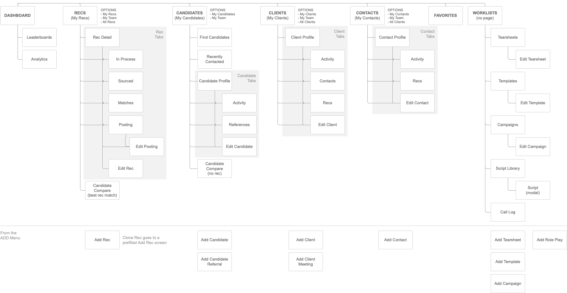
Recruiting Platform
Manage jobs, auto-match qualified candidates, and manage client relationships through this all-in-one recruiting platform.Case Study Deep Dive
Vision + Strategy
Product VisionExplored and defined through a workshop with stakeholders and selected users, the Product Vision drove design decisions.
Spades Product Vision
Provide timely and valuable information to our recruiters so they can make informed business decisions and take action.
Design Strategy
I explored design strategy through
- Competitive analysis
- Surveys
- Workshop with stakeholders and selected users
The Design Strategy was defined and finalized as a team in the Workshop where we also set priorities and the start of a loose roadmap.
The Design Strategy Blueprint (AKA “The Blueprint”) was used often throughout the project to bring clarity to our vision and scope.
For a deeper dive, visit the full case study.
Guiding Design Principles
- Design with intention and purpose - limit distractions and use context
-
Work where they work - Information made available wherever our users are
-
Digital First - Bring offline activities into the digital space whenever possible
As an impactful example of “Work where they work,” I designed integrated tools to help the users work smarter from wherever they were on the web through Outlook and Chrome extensions - Outlook, LinkedIn, GitHub, Behance, etc. This enabled the users to access the most current information on a candidate or client within seconds rather than minutes, which increased engagement, user satisfaction, and productivity.
Research
Interviews + Observational Research- 8 users: 3 recruiters, 2 account managers, and 3 hybrid users (account manager + recruiter or “full desk”)
- Inquired about their day from the time they wake up until they go to bed
- I aimed to get a general understanding on how they work in and outside the office, their goals, what’s important to them, and what drives them
- Watched how they worked with other software to keep their business organized
- Listened to how they approached phone calls and how they juggled taking notes and sharing information with candidates and clients
Understanding Our Users
- This is a sales-oriented business - keep the application quick and snappy to easily get to the information within 1-2 clicks.
- Highly competitive atmosphere where users are driven more by “winning” than the actual dollar (money was a close second driver, however)
- The fastest recruiter with the best candidate wins. This speaks to the need for immediacy and a fast system
Workshops and Feedback Sessions
I used this time to record ideas and gain clarity from the business and users and to confirm design assumptions through user feedback.
Lessons Learned
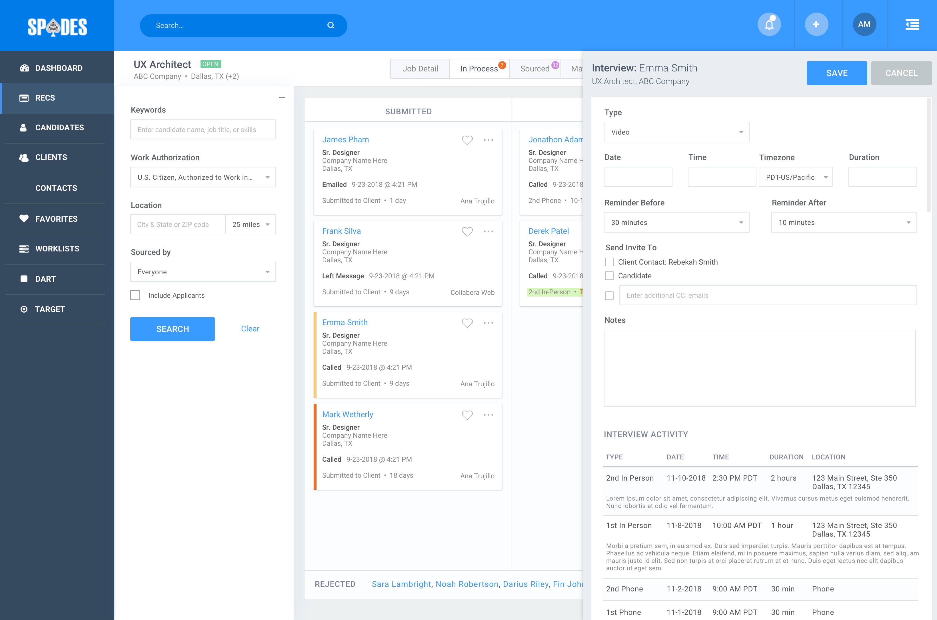
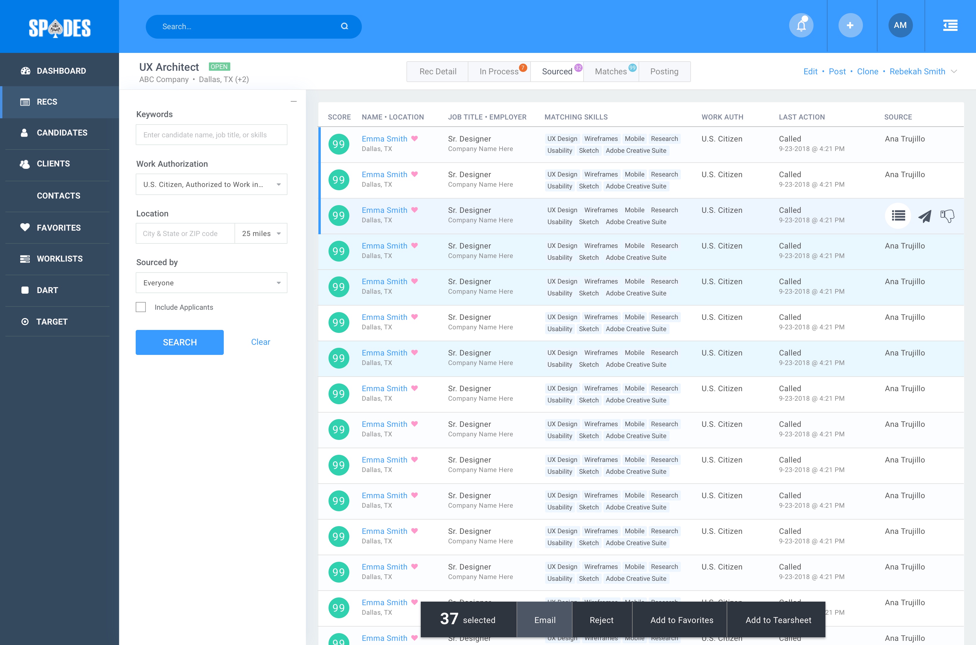
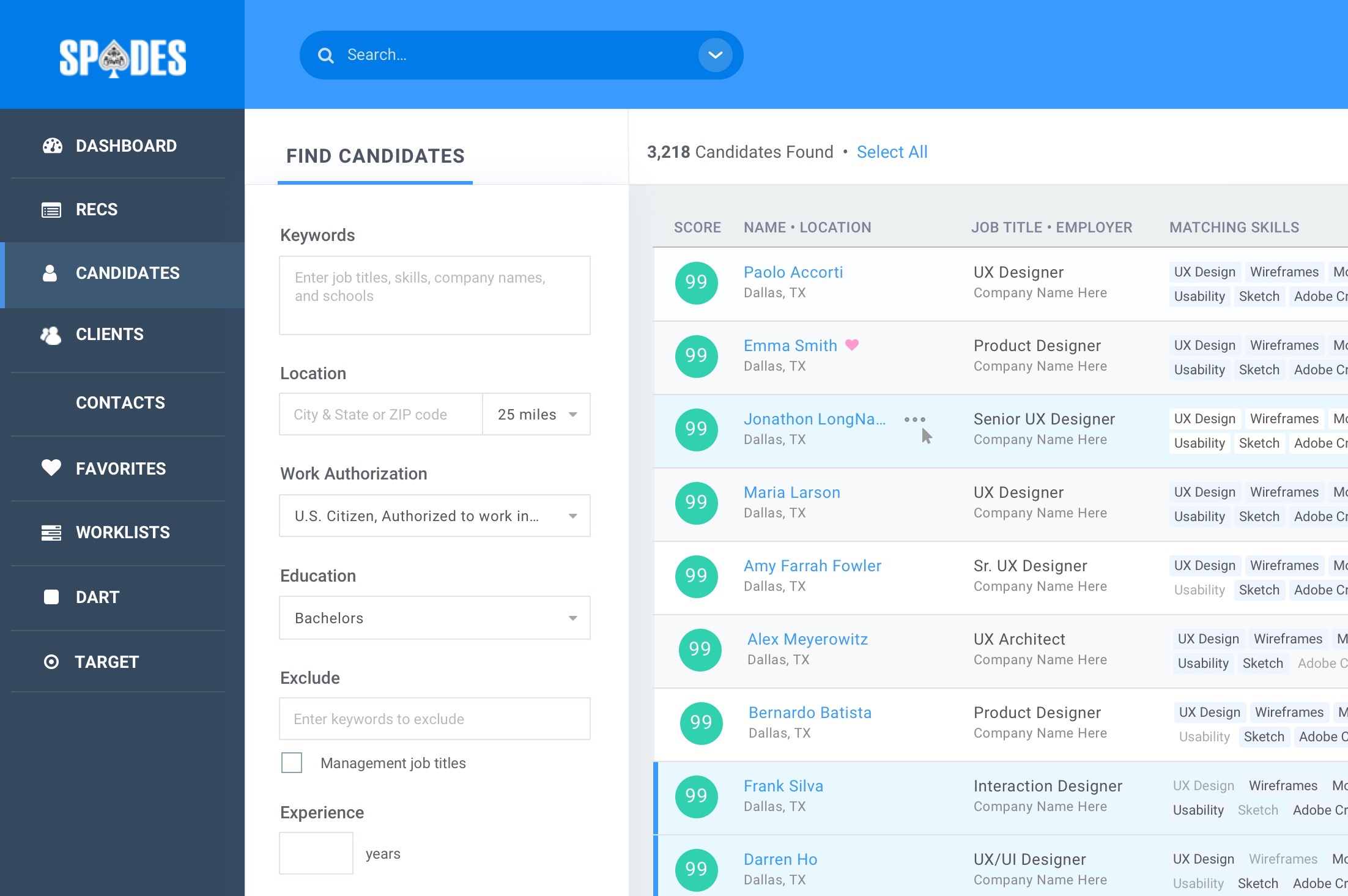
Data Display: Card vs. Data TableWhen you are scanning through hundreds (maybe thousands?) of candidates a day, displaying that data in a card view slowed the users down considerably. Quickly moving their eyes down a column of data was much faster to compare many candidates within seconds rather than having to jump their gaze from one card to the next across the screen.
SOLUTION
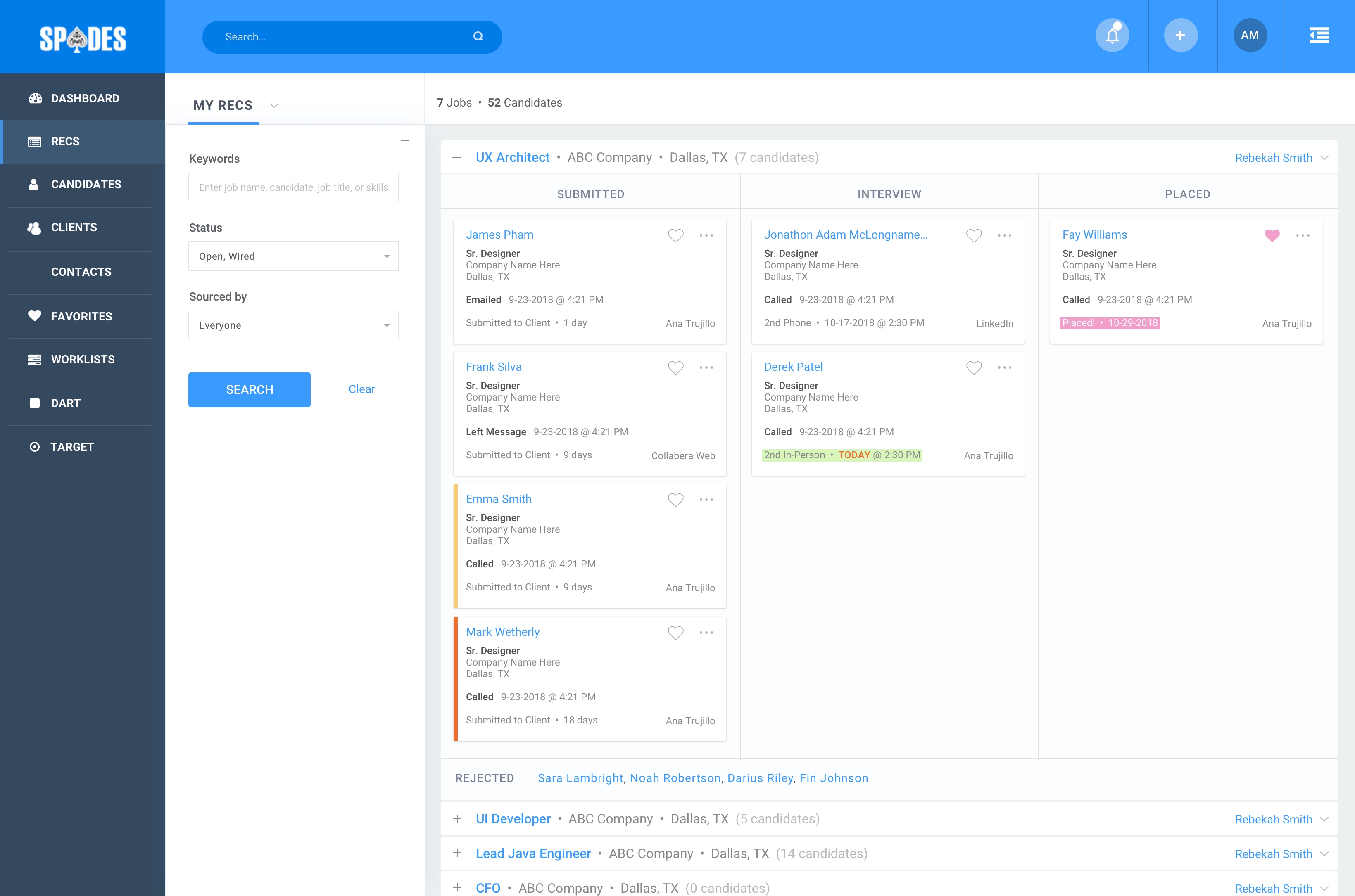
For large data sets, a data table was used for faster scanability. For smaller data sets (<20), cards could be used to organize in a workflow design pattern (much like Kanban).
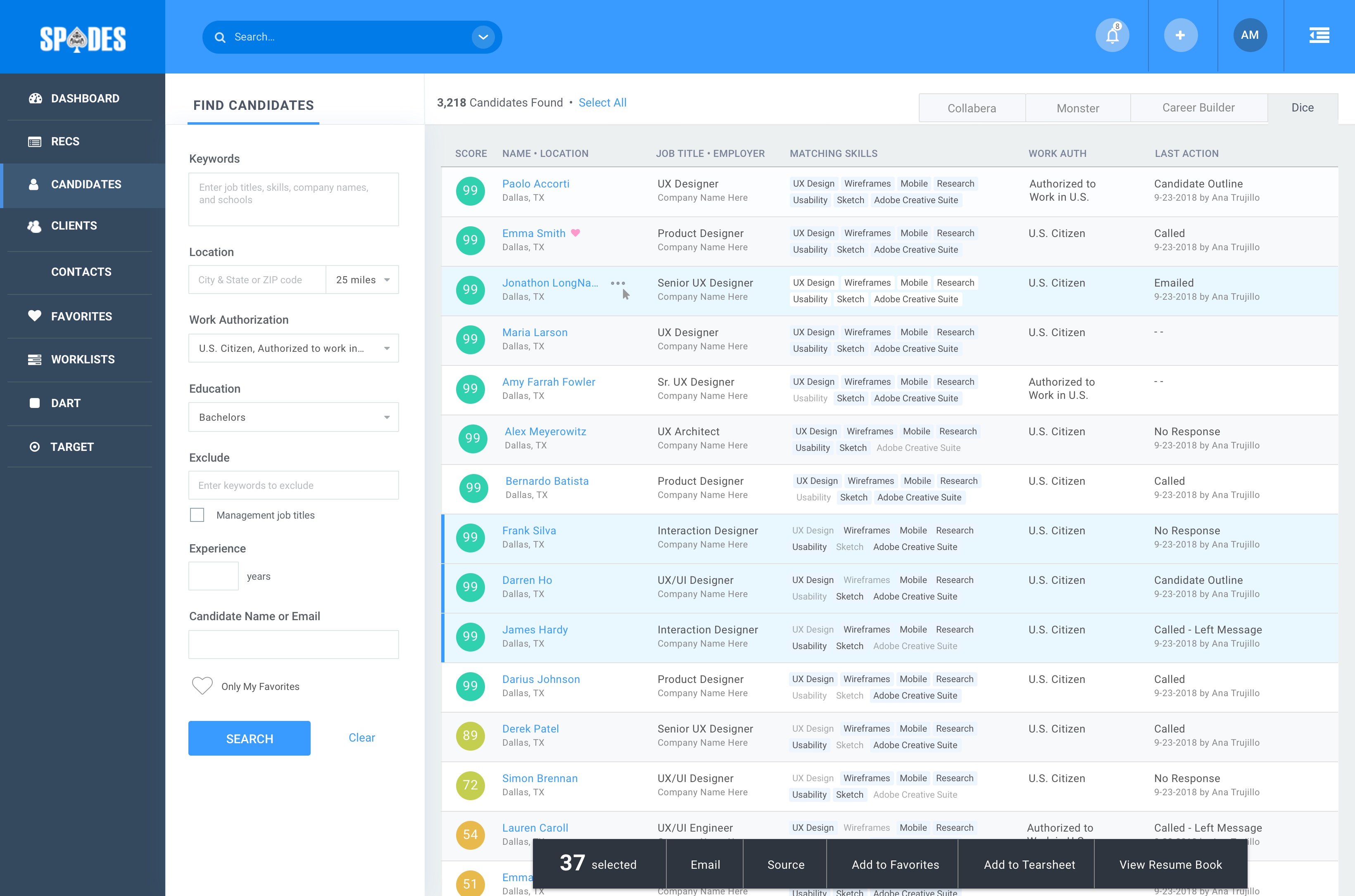
Quick Access to Data: Work Where They Work
Account Managers, Recruiters, and Sourcers spend much of their time in their email (in this case, Outlook), LinkedIn, GitHub, and other platforms to find talent and surface new business opportunities. The business has rules to follow so that a candidate or business partner aren’t contacted many times by different people in the organization, which keeps the brand from becoming tainted. To honestly follow those rules, was cumbersome, to say the least. Searching for those contacts required the user to jump between the 3rd party platform and internal system and took many minutes (if they performed the task at all).
SOLUTION
I designed a Chrome plugin and Outlook plugin which directly connected with the internal system and provided context to the user in seconds rather than minutes. Smart integrations for recruiters and account managers allowed them to view, take action, and jump directly into the Collabera systems.
Spades is a full-desk (account manager + recruiter) recruiting platform supporting over 2,500 professionals with their business goals through research-based features that include:
Results
My Role
Design Strategist, Lead Designer & UX Director
Team + Stakeholders
CTO, Project Manager, 6 Developers, Data Architect, VP of Direct Hire Recruiting, Account Managers, Recruiters, and Sourcers
- Quickly create and auto-post jobs to 200+ job boards
- Find and auto-match candidates from internal systems and 3rd party integrated sources
- Manage applicants throughout the hiring process
- Smart integrations with Chrome and Outlook plugins
- Business development and client relationship management
- Email marketing
Results
- Time on key tasks reduced greatly
- Viewing Candidate or Client activity reduced to less than 10 seconds from over 6 minutes
- Creating and posting to over 200 job boards in 3 minutes rather than 3 days
- Comparing qualified candidates takes less than 2 minutes rather than over 15 minutes
- Onboarding/training decreased by 117%
- Gamification increased engagement by 60%
- Due to the overwhelming success of the user experience, all systems throughout the company now use the Spades Design System, decreasing development and training efforts and increasing user acceptance
My Role
Design Strategist, Lead Designer & UX Director
Team + Stakeholders
CTO, Project Manager, 6 Developers, Data Architect, VP of Direct Hire Recruiting, Account Managers, Recruiters, and Sourcers
Design